[CSS] Tailwind 主題色的切換
必備知識:
CSS、HTML、JS、React
Tailwind 提供了深色模式(Dark Mode),可以自行設定深色模式時的樣式,只要在 CSS class 前面加上 dark: 關鍵字:
<div class="text-black dark:text-white"> {/* ... */}</div>假如我們要做「主題色切換」的功能,dark: 這個用法也許可行,但也只限於兩個主題色的切換,另一個缺點就是到處都要加上 dark: 的切換樣式,這聽起來不是一個好的做法。
想跳過本文廢話、直接看最終實作結果的同學,請走傳送門。
在 Tailwind config 的自定義主題色盤
Section titled “在 Tailwind config 的自定義主題色盤”在 Tailwind 的 config 當中,其中一個客制化的選項,就是可以自定義顔色的 class,例如:
module.exports = { theme: { colors: { primary: "#0d6efd", secondary: "#6c757d", danger: "#dc3545", warning: "#ffc107", }, },};PS. 以上的名稱及色碼取自 Bootstrap 的主題色盤
若我們有兩個主題色,config 就必須寫成這樣:
module.exports = { theme: { colors: { "theme-1-primary": "#0d6efd", "theme-1-secondary": "#6c757d", "theme-1-danger": "#dc3545", "theme-1-warning": "#ffc107", "theme-2-primary": "#0d6efd", "theme-2-secondary": "#6c757d", "theme-2-danger": "#dc3545", "theme-2-warning": "#ffc107", }, },};如此一來,就要在 HTML 上去抽換不同主題的 class:
function Button() { const buttonTheme = isTheme1 ? 'bg-theme-1-primary' : 'bg-theme-2-primary';
return <button className={buttonTheme}>;}到處都要有這樣的判斷,看來也不是明智的做法。此外,若我們有四、五個主題要切換,就不是三元運算可以簡單解決的事。
CSS 的全域變數
Section titled “CSS 的全域變數”CSS 提供了變數的功能,可分爲區域變數與全域變數。
定義 CSS 區域變數,下面這個 --main-bg-color 只能在這個 scope({} 刮號)裡面使用:
element { --main-bg-color: brown;}比較常見使用 CSS 變數的方式,是使用 CSS 全域變數,建立一個稱作 :root 的 pseudo-class,裡面定義的變數在整個 HTML document 底下都可以使用(其實就是全域變數了):
:root { --main-bg-color: brown;}使用 CSS 變數時,用 var() 這個函式,將要使用的變數作爲參數傳進去:
element { background-color: var(--main-bg-color);}Tailwind 與 CSS 變數
Section titled “Tailwind 與 CSS 變數”我們結合 Tailwind 及 CSS 變數的特性,就可以達到主題色盤抽換的目的,我們將方才 config 中寫死的色碼,用 CSS 變數取代:
module.exports = { theme: { colors: { 'color-one': 'var(--color-one)', 'color-two': 'var(--color-two)', 'color-three': 'var(--color-three)', 'color-four': 'var(--color-four)', 'color-five': 'var(--color-five)', }, }}設定好 Tailwind config 之後,接著就是定義各主題色盤變數的時候了
const theme_ayanami = ` :root { --color-one: #1d446c; --color-two: #f1f1f1; --color-three: #571a1a; --color-four: #000000; --color-five: #525252; }`;
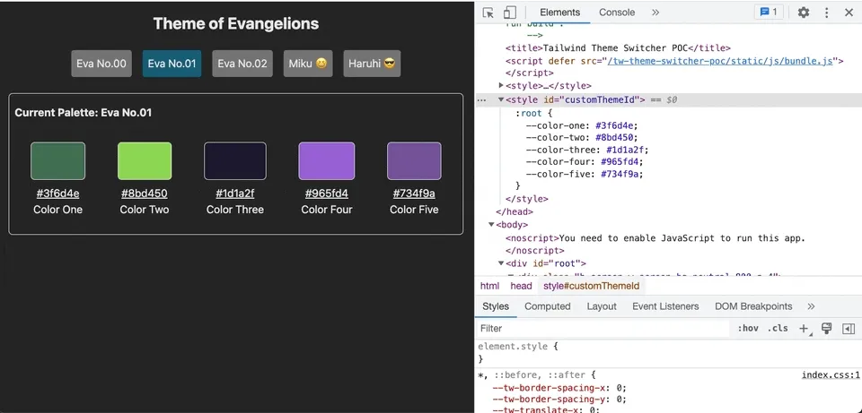
const theme_ikari = ` :root { --color-one: #3f6d4e; --color-two: #8bd450; --color-three: #1d1a2f; --color-four: #965fd4; --color-five: #734f9a; }`;然後將變數包在 <style> 後,安插在 <head> 裡面:
function App() { const [currentTheme, setCurrentTheme] = useState("ayanami");
const getThemeVariables = (_theme) => { switch (_theme) { case "ayanami": return theme_ayanami; break; case "ikari": return theme_ikari; break; } };
useEffect(() => { if (!document.getElementById("customThemeId")) { const head = document.head; const newStyleElement = document.createElement("style");
head.appendChild(newStyleElement); newStyleElement.id = "customThemeId"; newStyleElement.innerHTML = getThemeVariables(currentTheme); } else { const styleElement = document.getElementById("customThemeId");
if (styleElement) { // 更新 CSS 全域變數 styleElement.innerHTML = getThemeVariables(currentTheme); } } }, [currentTheme]);
return ( <div> <button onClick={() => setCurrentTheme("ayanami")}>凌波零</button> <button onClick={() => setCurrentTheme("ikari")}>碇真嗣</button> </div> );}在這裡定義了兩個主題,分別是「零號機」與「初號機」的主題色,此後,就可以在 HTML 上使用了,例如:
<div class="bg-color-one"></div>藉由抽換 <style> 的内容,將新切換的主題變數複寫進去,便可以主題切換了!
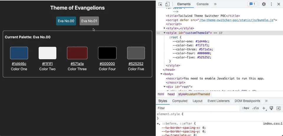
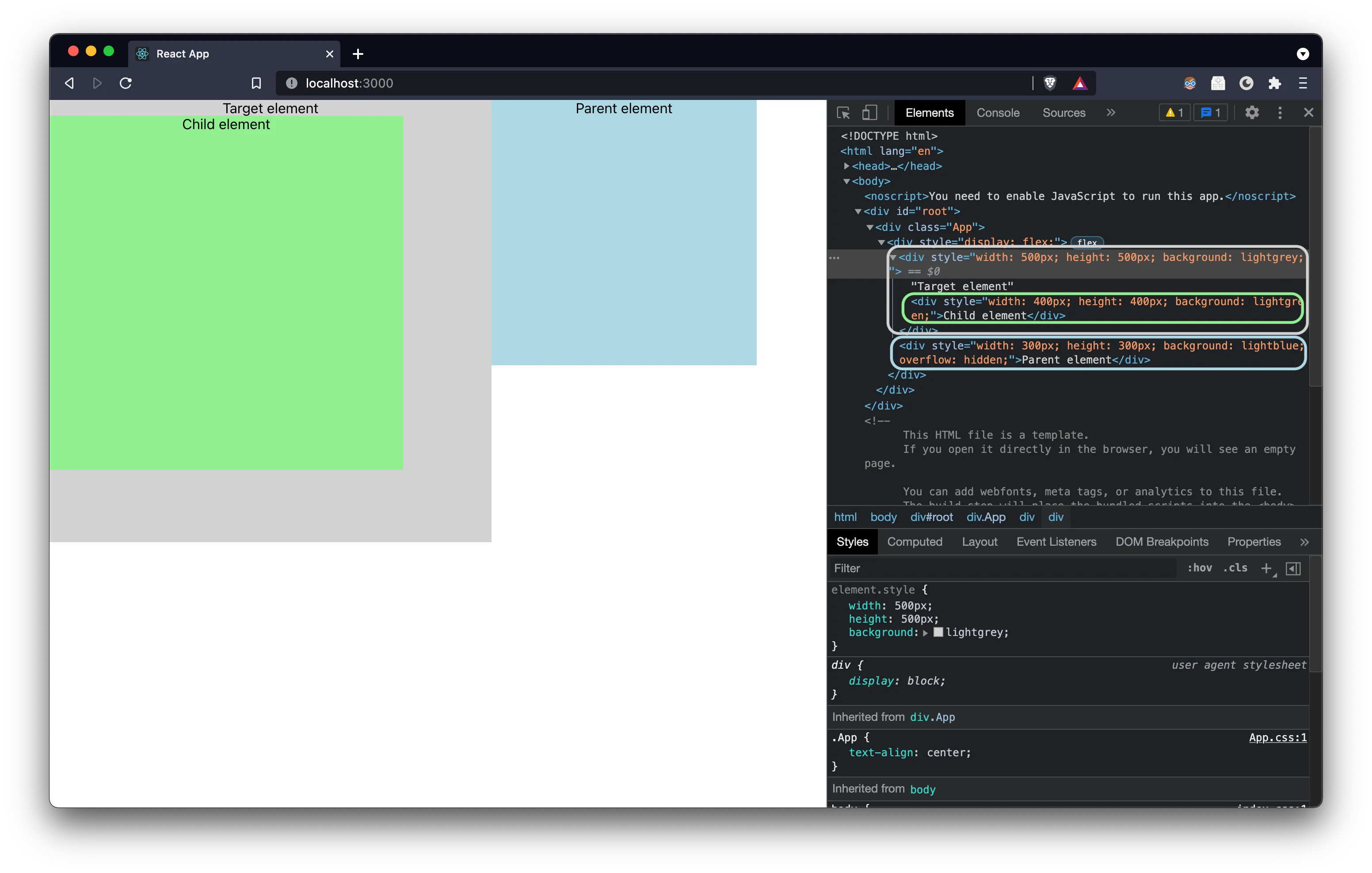
從瀏覽器的 Dev Tools 中,可以看到我們只抽換了 CSS 的全域變數,元件的部分都沒有異動
同場加映!「初音未來」跟「涼宮春日」的主題色!😘
若想看整個範例的結果,請前往這裡
範例原始碼,請參考這裡
我們利用 CSS 全域變數的特性,並搭配 Tailwind 的客制化顔色設定,實現了主題色切換的目的。優點非常顯著,我們在切換主題的時候,不用動用任何一行原本的 HTML、不用改動任何的 CSS class,也不用在元件裡面寫切換主題的邏輯,就可以快速達成主題切換的效果。
再來是 CSS 全域變數的部分,各主題的變數其實就是一個字串,上面的範例直接放在 JS 裡面,因此若遇到要更新主題顔色、或新增新主題色時,仍必須重新打包(build)一次前端的專案。若要避免重新打包,就要看 CI/CD 的架構策略,將這些字串移到別的地方,然而這不在我目前擅長的領域,也非本次討論的重點,就交由各位同學去發揮吧!
以上,Tailwind 主題切換分享到這裡,祝各位開發愉快 😎